![]()
INTRODUCTION
First I have to tone down your possible expectations: unfortunately you won’t be able to use such color calibration with games with the current pitool.
However you will able to use it for viewing pictures and watching videos/movies.
Using such calibration with games could become possible if Pimax was adding ICC profile support to pitool.
I have asked for that many times in the past and I hope what will be shown below will make the Pimax community support the request of adding such support to pitool !
Secondly, if you are reluctant to read long technical posts and prefer to have a quick overview of the results of this calibration you can scroll down to the samples I provide further down this post ![]()
But if you do this please read the disclaimer you will find just above those samples at the end of this post, so you don’t misinterpret them.
I still recommend you to read the technical part below as it will help you to interpret the samples provided at the end.
Regarding the technical part below, I’m not a pro nor an expert with color calibration, just a hobbyist who has learned by himself by practicing and reading technical literature.
If you are expert and notice some mistakes feel free to correct me of course ![]()
I have tried to be not too technical so people with no knowledge at all can maybe learn useful things for when they may want to do their own calibration for their own displays (like their own headset).
Finally, as another disclaimer, please note the figures below only concern this headset sample and the “relatively cheap” colorimeter used is not as precise as more professional (and much more expensive^^) tools. Colorimeters can also drift over the years and may have to be recalibrated to be able to continue giving accurate readings. However the final result I have obtained was pleasant enough to my eyes to decide to publish these results here.
So let begin with an overview about how much the colors of this 5k+ sample can be improved ![]()
![]()
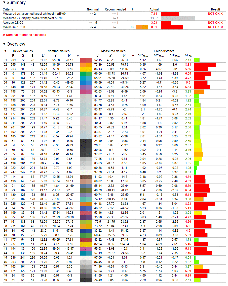
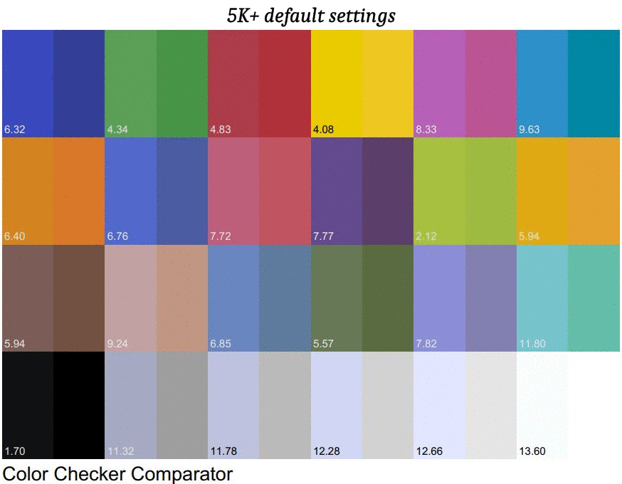
COLOR CHECK

Color checker is a feature of the calibration software showing requested colors (by your game for example) and displayed colors (by your VR headset).
The requested color is known (by the software requesting it. Here, the calibration software), and the displayed color is “captured” by the probe of the colorimeter (I1 display Pro here).
Requested colors are at the right side, displayed colors at the left.
The number for each color is called ∆E (delta E).
There is a lot of literature about ∆E because you can calculate it with different formulas giving more or less accurate results.
To try to make it simple, the lower this number, the closer is the displayed color from the reference.
Also typical ranges for our purpose (watching movies, looking at pictures, playing games) are:
∆E between 1 and 2 = very good (difference between requested color and displayed color will be subtle for most people)
∆E between 2 and 3 = good
∆E between 3 and 5 = more or less acceptable
∆E above 5 = begins to be problematic for people who cares about color accuracy
Click here to read a deeper analysis
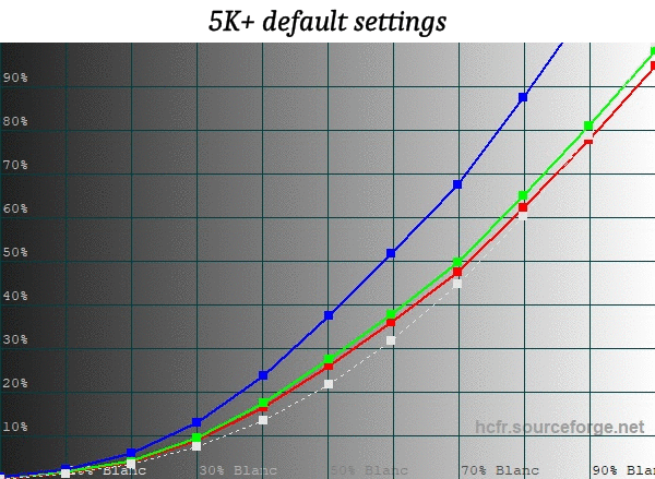
As you can see the colors of this 5K+ sample are noticeably off with the default settings.
You may have noticed a blue tint, especially if you look at the few grays requests at the end of this chart.
You may also see some greens are too yellowish, which will result in some grass/foliage in your games/pictures/movies look unnatural, sometimes almost fluorescent.
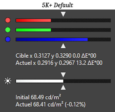
Due to other tests showing an excess of blue (we will see that below) I have decided to begin with playing with the RGB parameters offered in pitool.
Contrast parameter is modifying the “white level”, while brightness parameter modifies the “black level”.
Changing one or the other will also affect all the intermediate levels at a lesser degree, not only max (=white) and min (=black).
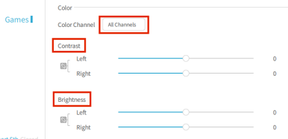
Using the main brightness/contrast controls will equal to adjusting this parameter for the three R, G and B channels simultaneously:
But you can also use the pitool feature to change brightness/contrast on the 3 channels independently (R or G or B), which is what I have done here with the Blue channel:
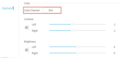
I have first decreased Blue contrast by 1. This means the highest value of blue will be less. This will also decrease, at lesser degrees, all the intermediate values of blue between maximum and minimum. The further from maximum, the less this intermediate level will be decreased. This means brightest blue will be more affected than darkest blue. It would be the complete opposite if we had changed the brightness parameter instead of contrast.
You can notice how this simple change already removes a significant part of the blue tint in all colors. It is the most noticeable on the grays at the end of the above color chart.
I have then tried Blue contrast -2 but this was too much. The best value was between -1 and -2, which means having smaller increments in pitool for those contrast/brightness parameters would already have some benefits.
But there is another way to try to decrease the amount of blue at an intermediate value: play with blue brightness. So next I have stacked blue contrast -1 and blue brightness -1.
The result is even more accurate grays (we’ll talk below about what is our “target”). Some other colors are improved, while others become worse.
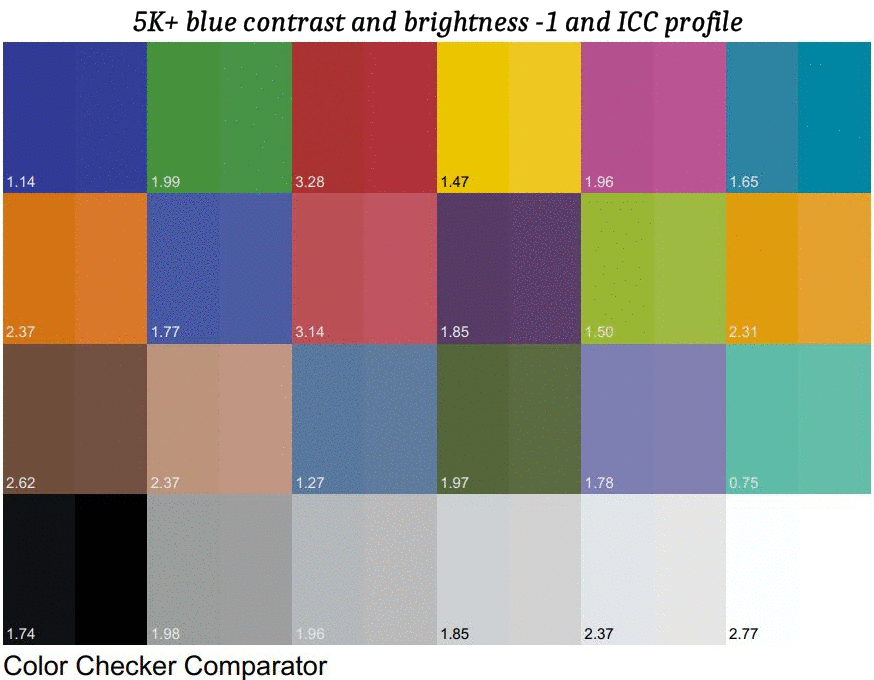
Finally the last chart in this slide show presents the result of the use of an ICC profile.
An ICC profile is made by the use of a colorimeter (hardware probe + software) that will test a given set of various colors (more than 100 here), collect the differences seen by the probe when capturing the colors displayed by the headset, and create an ICC profile (.icm file) to allow softwares using it to compensate for those differences (this means the software has to support color management).
Any software using that profile will then “intercept” the colors requested by the source (like a picture, a movie, but it could also be a game) and apply the modification needed so that the color displayed by the headset is as close as possible to the requested source color.
By my readings about color calibration it seems a color profile will achieve better results when it has the minimal work to do.
This is why I have done this final calibration step starting from the Blue contrast and brightness -1 from the previous steps, and not from the 5k+ with default parameters.
As you can probably see the final result is MUCH closer to the “target”.
Also the last step (ICC profile) has much more influence than what was achievable by only using the current pitool parameters.
The result of this calibration is much more natural colors on the several pictures or movies I have tested (see samples at the end of this tech part).
Grass and foliage colors is the most visible improvement for me (no more fluorescent green), but also blue sky, flowers, wood, stone etc. Everything looks more natural.
![]()
RGB RESPONSE
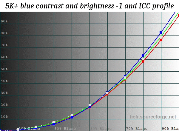
Let continue with an easy one. This one shows the response for R, G and B channels from 0 to 100% levels.
The dotted line is our target (more about the target in the next paragraph).
You can easily see how blue levels are exaggerated by default, and it gets more and more exaggerated as you increase in level (= on brighter areas of images).
Click here to read a deeper analysis
Blue contrast -1 already does a great job to fix this, regrouping the blue curve with the R and G ones that were already closer to the target (dotted line).
Note how modifying the blue channel also slightly affects the other 2 channels. You must keep this in mind when doing calibrations by using the parameters from the display (here, pitool parameters).
Adding blue brightness -1 makes the blue line even closer to the dotted line target and regroups even more the 3 channels lines there.
Looking at this chart alone one may conclude adding the -1 blue brightness gives a better result than -1 to blue contrast alone but this is not necessarily true. We have seen the former was resulting in better grays (in the color check section above), but some colors were also becoming worse, and we’ll see other aspects below that we are not aware of yet with the informations we have examined so far.
Again here, the ICC profile step is what produces the most accurate result as it regroups the 3 RGB lines over the dotted target line, with all now also nicely following the curvature of this reference line.
![]()
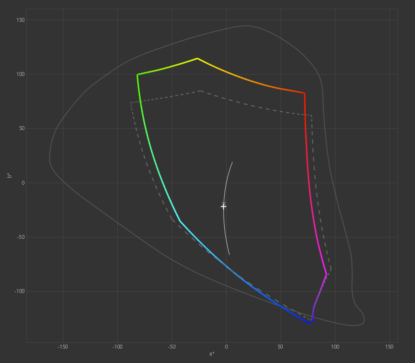
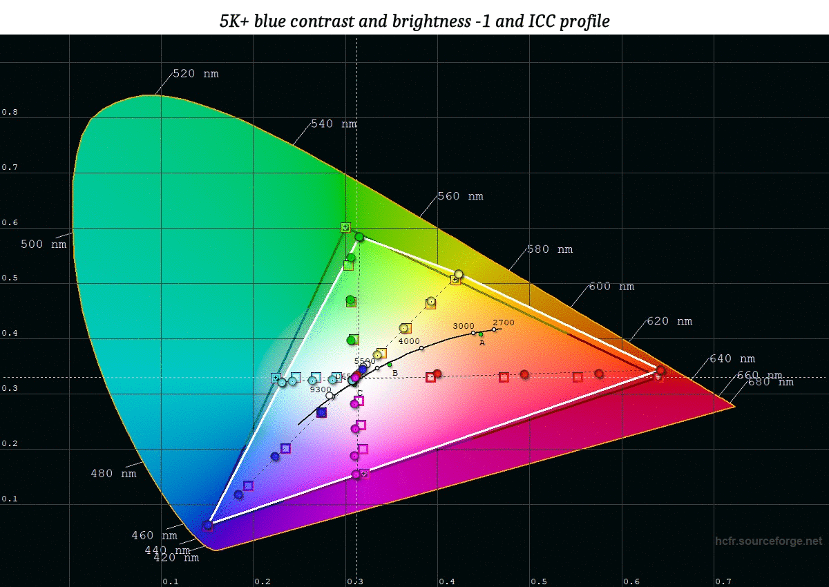
CHROMATICITY DIAGRAM
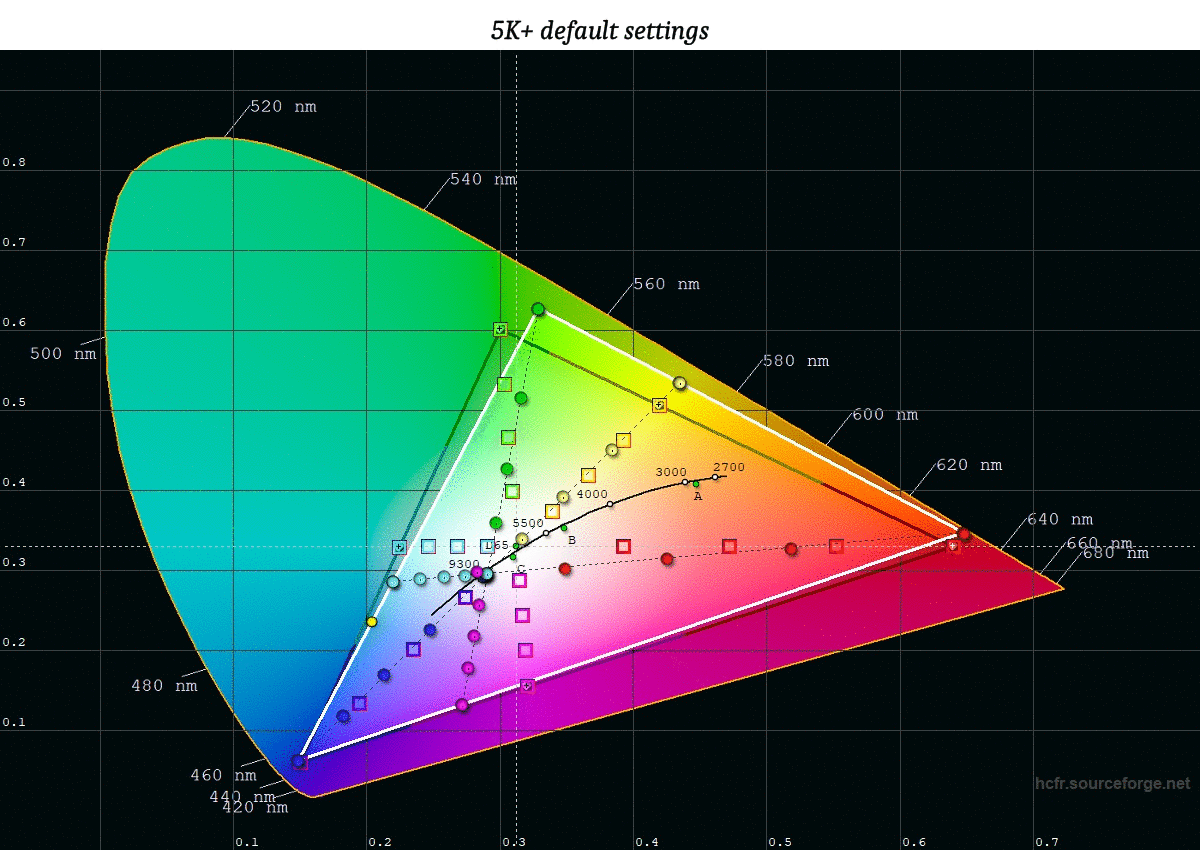
This one is a bit more complex but extremely helpful for checking your calibration steps when doing incremental modifications on parameters from the display you are calibrating.
We see a RGB color space (the whole colored area) with a black triangle limiting a more restricted color space (here, sRGB color space) and a white triangle showing the colors this 5K+ sample can display with its current parameters (this range of colors is called its “GAMUT”).
sRGB is the color space used for all games and is also similar to the rec.709 color space used for HD videos.
This is why I chose this as our “target” for calibrating this 5K+.
Click here to read a deeper analysis
Before I continue let define a bit more this “target”.
We have just said it will correspond to the sRGB color space, but it will also be defined by:
- a white temperature (in Kelvin)
- a gamma (no unit for this value)
- a maximum white luminance (cd/m²)
The maximum white luminance will just be the max the headset can do (we could have decided to limit it with this ICC profile).
We’ll deal with gamma in a later step.
The white temperature target is 6500K (also called D65). This is the white temperature at midday (sun high in the sky), without clouds, at northern Europe latitudes.
On the chart you can see a black curve in the middle of the black/white triangles: this represents the white color at different temperatures.
With a high temperature the white (and the whole colors of the displayed image) will become “colder”, and a lower temperature will make the white warmer.
Following this line it is easy to see white will drift toward blue for cold temperatures and toward red for warm temperatures (first yellow, then orange).
Note color temperature is a matter of taste. For example I often use temperatures lower than 6500K for my desktop monitor because it saves my eyes (less blue).
White is made of the addition of the 3 primary colors (R,G and B).
There are also 3 secondary colors: Cyan, Magenta, Yellow.
Secondary colors come from mixing 2 primary colors. For example, Cyan is the result of Blue+Green.
In the chart you can see points and squares for each primary and secondary colors.
The goal, you will guess it, is to match the points (= our 5K+ measurements with the color probe) with the squares (= reference values for our current target).
The squares represent specific saturations levels for the 3 primary and secondary colors. Those saturation levels are: 0%, 25%, 50%, 75% and 100%.
Two kinds of problem can occur:
- the points are forming a line not aligned with the line made by the squares → this means the color itself is not accurate, it is drifted toward nearby colors in the color space.
- the points are aligned with the lines made by the squares but are too far or too close from the center point → this means there are saturation errors.
As you can notice, the whole 6 lines (from 3 primary and secondary colors) are crossing each other at the white point.
Now look what happens between the default settings chart and the next one (corresponding to me just applying -1 to blue contrast in pitool): this simple parameter change in pitool makes the white temperature drift toward a warmer white.
As the 6 lines are crossing at this white point, this means those also a move to follow the new white temperature.
This is not all, you don’t see it on the chart but the whole colors (from the 5K+ GAMUT) are in fact moving too ! If we had many other points from various colors captured by our probe, all those would move too to follow the movement of the lines. Imagine this as a fabric, you pull the middle point and the whole fabric is stretched, with any point of this fabric moving to another place.
![]()
So let see what we can conclude about this 5K+ sample at the default settings:
First, several colors are not aligned with the lines formed by the squares.
While Blue and Yellow are well aligned, Red and Cyan are moderately misaligned, and Green and Magenta are significantly misaligned.
For green for example, this means when a game will request a 100% saturated green (green square at the top edge of the black triangle) the headset will display a green drifted toward yellow (the top green point, outside of the sRGB color space represented by the black triangle).
For Yellow the color tone is correct but the saturation is not: when a game will ask a 50% saturated yellow (yellow square located above the 4000 figure) it will display a Yellow closer to 25% saturation (yellow square at the top right of the 5500 figure).
With the 3rd chart in the slide show, where Blue brightness -1 was added to Blue contrast -1, the whole lines are moving again and the placement of the points (alignment with square lines and square holes) gives you a quick overview to compare if adding -1 to blue brightness really brings an overall improvement over just modifying blue contrast alone to -1.
As with the color charts from the beginning, we can see here some colors become more accurate but other colors are getting worse, and it is easier to understand with this chart “where things are going wrong” compared to random colors checks (and thus, what other parameter(s) we could modify to try to fix the remaining problems).
Lastly, we see again the ICC profile is what brings the most accurate result, with all 6 lines well aligned with squares (only magenta remains a bit misaligned) and many points standing into their respective square meaning good accurate saturations. There are still some saturations “off” and you easily see which ones and what kind of imperfections it will make in displayed picture. For example we can conclude even with this ICC profile colors around red color will still most often be over-saturated. Reading through the web I have seen comments saying the software I have used for this calibration may have this issue with the red channel, so I will try again with other softwares later.
![]()
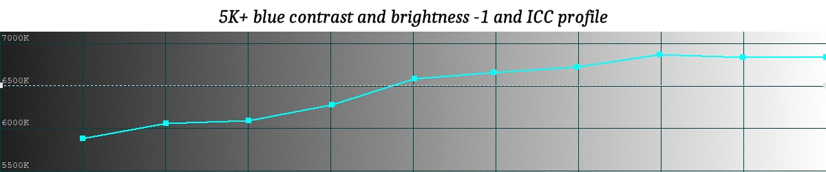
TEMPERATURE
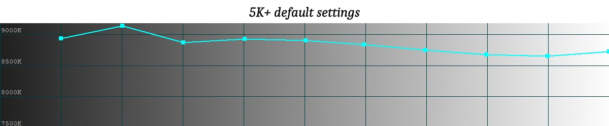
After the more complex chromaticity diagram, back to a more simple one.
This one is important to understand temperature is not a unique value but can vary between dark and bright areas of the displayed image.
Of course the goal is to have a flat line here. This would mean you would keep the same color temperature for dark and bright areas of images (or dark images VS bright images, dark game environments VS bright game environments, dark movie scenes VS bright movie scenes).
Click here to read a deeper analysis
Here are white temperatures I have obtained with some pitool settings I have tried:
- default settings: 8650K (relatively cold, blue tint)
- blue contrast -1: 7000K (already much warmer, way less blue tint)
- blue contrast -2: 6000K (a bit too warm compared to the 6500K target but I would personally be perfectly ok with this temperature)
- blue contrast -3: 5350K (significantly warmer compared to the 6500K target, but it would still be fine for my taste)
Contrast -2 was tempting at first, because this setting also makes this 5K+ sample produce the best primary Blue color (∆E=1.3, compared to 3 for blue contrast -1, and 6 for default settings).
But as most often in calibration everything is a matter of trade-offs and -1 was giving a better overall result.
Back to the temperature chart slide show, you can see that in addition to making the temperature warmer the blue contrast -1 modification also produces a flatter temperature line, meaning a more steady temperature between dark and bright areas/images compared to the default settings.
Then on the 3rd chart, after I have added -1 to blue brightness, we see the left side of the curve is diving into warmer temperatures.
This is the result of decreasing the blue “black level” (brightness -1). This means there will be less blue in dark areas of displayed images, which results in warmer temperature there.
Finally, we can notice the ICC color profile doesn’t add much to the temperature accuracy and more importantly it doesn’t fix the dive of the curve into warmer temperature for dark areas.
I have only noticed the latter as I was writing this post. If I had noticed that at the time of doing the calibration maybe I would have done the ICC profile over -1 blue contrast rather than over -1 blue contrast+brightness.
This seems to confirm it is better to make the display the most accurate using its internal settings before creating the ICC profile on top.
![]()
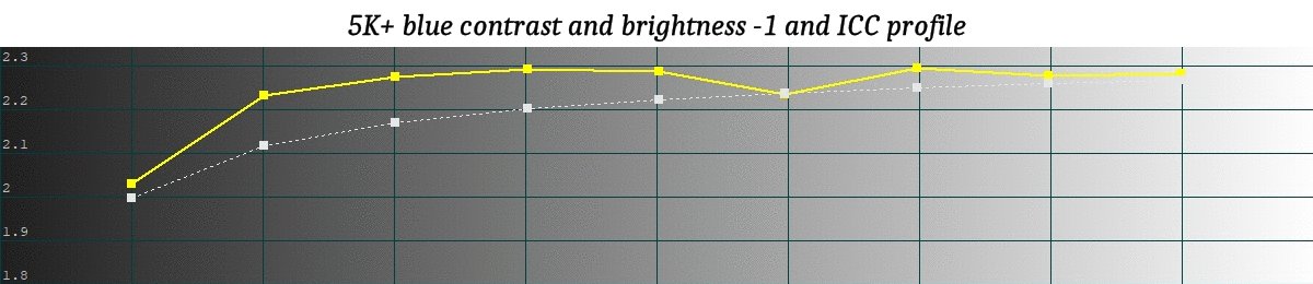
GAMMA
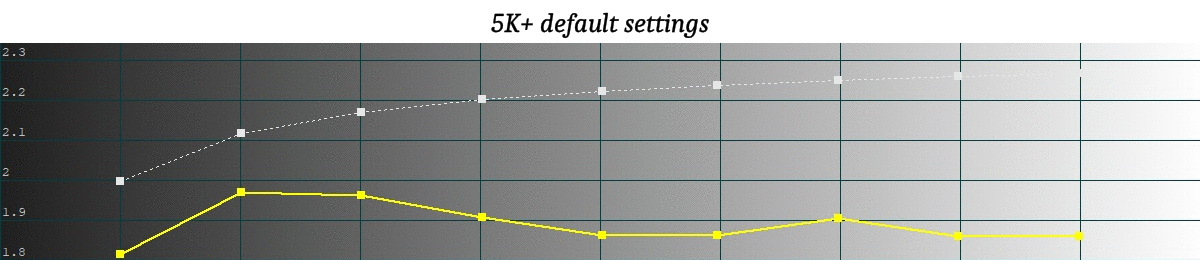
Gamma sorts of modifies the contrast of the display.
Lower values will make the image brighter but also more flat, lacking 3D depth and making colors dull.
Higher values will make color more vivid, add contrast, and the result will be a gain in 3D depth too. But if you go too high you may lose details in dark areas.
Click here to read a deeper analysis
As temperature, gamma is a matter of taste. There are no good or bad values, you must try and keep what you prefer.
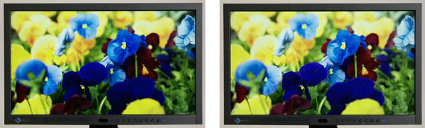
Most PC LCD monitors use a 2.2 gamma by default (1.8 on mac). 2.2 gamma is also very often used by people calibrating their TV for watching movies.
Here is a picture from eizo website showing gamma 2.2 (left) VS 1.8 (right):
For VR gaming you could even prefer one value for a specific game and another value for another game, depending on the type of game, the artistic choices made by the creators etc.
This means that if you buy a colorimeter to create ICC profiles you may not only do a single profile for your headset but several ones as they are another method to tweak games to “fix” artistic decisions you may dislike (as can be done with directX injectors).
With this 5K+ sample the gamma with the default headset settings is about 1.9
Modifying blue contrast to -1 has almost no effect on this gamma.
Adding blue brightness -1 drifts the whole gamma curve up a bit.
The ICC profile has the most significant change to the gamma curve.
Note I thought I had set the calibration software to make the ICC profile with a 1.9 gamma target, as I wanted to try to stay close to the default gamma to limit the work of this profile, but it seems the profile was created with a gamma target of 2.2 (I’ll need to investigate why).
![]()
This is all for the technical part, now let have a look at the result in “real conditions” ![]()
![]()
SCREEN PANEL PICTURES BEFORE/AFTER CALIBRATION
// DISCLAIMER //
I have been wondering if I should publish such pictures as to be able to show the result of a calibration the whole chain should have to be calibrated, from my camera to your monitor display.
This will not be the case here but I have tried anyway as I wanted to check what kind of result I would get when watched on my own gaming (but calibrated) monitor.I have thought the result was interesting enough to publish the pictures but keep in mind they won’t reflect the exact result of the calibration as seen directly in the calibrated headset.
However you should be able to see the tendency the calibration has, especially the fact it significantly decreases the blue tint (warmer color temperature).If you have a good factory calibration on your monitor the calibrated 5K+ pictures should even look close to a relatively good 6500K calibration but keep in mind there will still be drifts from the camera taking the pictures.
Compared to how the pictures looks on my calibrated monitor, the result is better when watching directly at the calibrated headset.Also note pictures of the calibrated headset may lose some dark details. This is due to the 2.2 gamma calibration compared to the 1.9 original gamma (I have explained in the tech part above my initial intention was to calibrate at 1.9 gamma but the calibration software did a 2.2 calibration for some reasons).
////////////////
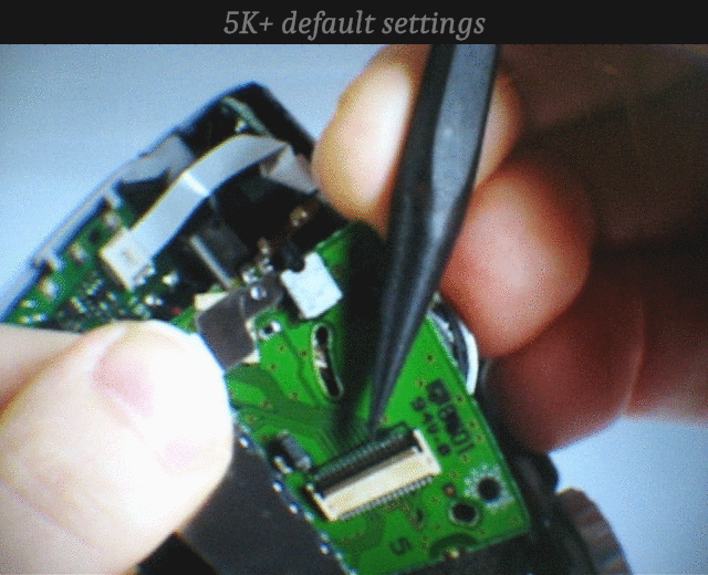
On this first picture we can see the improvement of the green pcb that looks less “flashy-green”.
Skin tone is also better, losing the original cold tone (blueish skin).
With a good monitor you should also see the grays become warmer, like the gray ribbon at the top of this electronics, or at the grayish background.
![]()
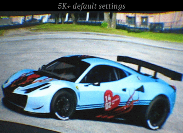
This second one shows what you could expect with games.
The improvement may seem less significant there to some people, due to the fact games often use very saturated colors.
The grass is improved but not as much as it can be on some pictures or movies. This will heavily depend on the green color used in the game, other green will have more significant improvements.
The blue of the car also seems only slightly improved but it is much closer to how I have designed this car (I’m not the author of the original design but did this skin myself). With the 5k+ at default the car looks like if the blue is “lit”, like neon-blue, whereas the calibrated 5K+ looks more like a metallic blue paint lit by the sun.
The most significant improvement here is the concrete. I am personally really worried when concrete from racing tracks look “too blue” like with the default 5K+ calibration. After calibration it looks “more red” as I’m used to see in real life.
![]()
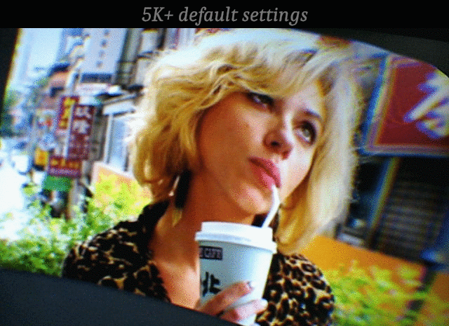
I find this still image from a movie shows the most significant overall improvement. Many aspect are improved like skin tone, foliage losing its blueish-green tint, blond hairs more vivid (lips too), orange panels much more vivid and really orange, buildings at the background get a much more natural color, and I find the 3D depth of the image is improved and overall contrast is better (thanks to the 2.2 gamma here).
![]()

While the 3 above pictures were displayed by a photo editing software that was applying the ICC profile, this last example is from a movie played with a video player (more about softwares below).
I have added that one to show movies/videos can also already benefit from a calibration profile, without any required support from pitool.
I am so pleased when I activate the support of the ICC profile while a movie is currently playing. The improvement is so much welcome to me who likes to watch movies one a calibrated plasma TV.
More depth, good color temperature, good color accuracy. The result is very good and only the poor black level remains as a drawback from the LCD panels (calibration can’t help with that).
In the sample above you can see improvements in stone color, flowers, foliage, skin tone, building glasses, or some clothes too.
![]()
As a conclusion, this shows the 5K+ image quality can be significantly improved (at least concerning this sample). Color accuracy has gone from average by default to very good once calibrated. Gamma can also be fine tuned to optimize the viewing of movies, pictures or to play games. I really wish Pimax will add support of ICC profiles to pitool so it can apply to everything and not only pictures ans videos. From what I have read this is done using 3D LUT processed by the graphic card. This more recent method has a much smaller impact on performance compared to doing it with the CPU as was done before (I have read from a video player developer that when the CPU does it you can’t play a HD movie smoothly anymore).
![]()
SOFTWARE INFORMATIONS
The characterization of this 5K+ (all the charts from the tech part above) was made using HCFR calibration software, a free software made by French video forum members.
The ICC profile was made using X-Rite I1 profiler (the software bundled with the X-rite I1 display pro colorimeter probe). I should try again soon using DisplayCAL this time.
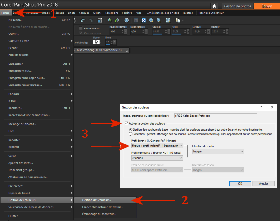
The pictures are displayed using paint shop pro 2018 (you can do it with photoshop too and I have read other picture softwares can use ICC profiles too. I haven’t checked the free ones yet).
Here is where you apply the ICC profile with this editor:
![]()
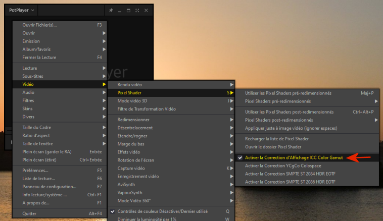
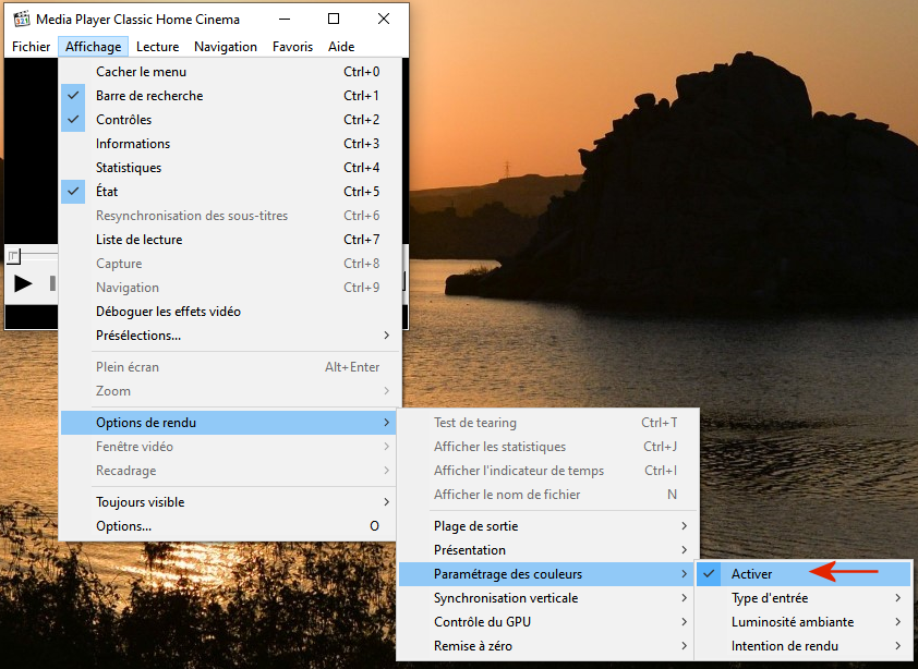
MPC-HC and potplayer are both able to apply ICC profiles to videos. I have initially tried MPC-HC on my TV then Potplayer with the 5k+ headset (with which I have made the movie sample published above).
For both you must use EVR custom present renderer. MadVR renderer also supports 3Dlut but I have not tried to make that work yet.
Here is where you activate ICC support in potplayer (it will apply the default profile set for your monitor in windows, see below):
…and for MPC-HC (in the same menu, below, you can chose between 3 different gamma):
![]()
And yes I will share the profile I have created for this 5K+ sample as I know people will ask for it, but keep in mind it may not give optimized results or even good results at all as panels can differ from one to another from the manufacturer production.
Even the same panel model can show differences and remember Pimax may have changed the panel manufacturer/model for the 5K+.
This ICC profile was made for a 5K+ with the serial number starting with 202 so people with 203/204 models may not have good results trying this profile.
It should be even worse if you try it with a 8K that is equipped with completely different panels than the 5K+, with warmer default colors. Ideally everyone should proceed to its own calibration of his own headset sample (which implies using a colorimeter probe).
![]()
Click here for installation informations
![]()
How to install:
1°) Download my ICC profile (5K+ - I1 profiler - 6500K - 2.2 gamma, despite it is named 1-9gamma): http://www.mediafire.com/file/ipribomt4ike5kj/5kplus_i1profil_nolensR_1-9gamma.icm/file
2°) Copy the .icm file to "C:\Windows\System32\spool\drivers\color" (there should be at least a sRGB profile there, this is the default one for windows)
3°) Open win10 oldschool color management in the oldschool control panel:
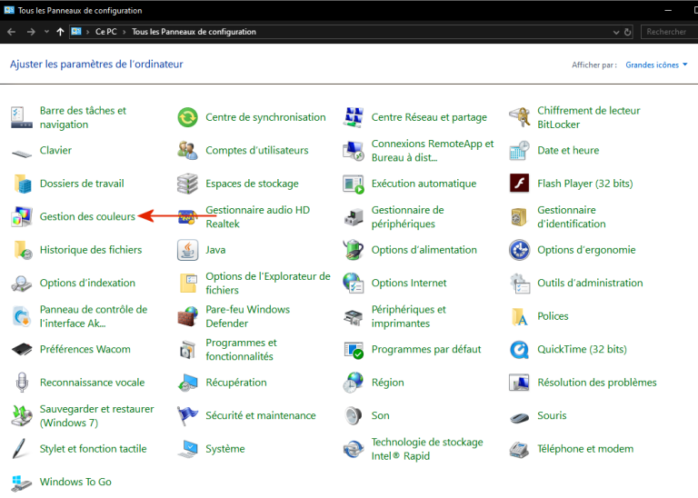
4°) In this win10 oldschool color management panel check “use my parameters for this device”, then “add”, then “browse” (in the new window that just opened), then select the profile you have downloaded. In the end it must show in the list in the first window (if not reclick “add” and select it in the list of the 2nd window).
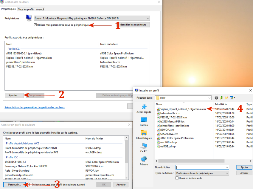
5°) When right-clicking your desktop and selecting display parameters you should now have the color profiles enabled here (if grayed-out check you have ticked the checkbox in step4) and the 5K+ profile should be present in the list. Select it if needed.
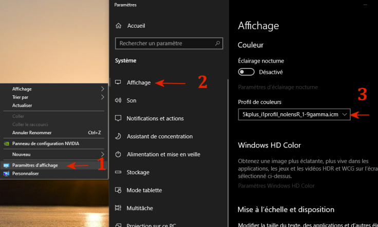
Once there, video players will use this selected profile when you activate their color management feature (for pictures you need to manually select the profile in the editor as explained above).
Pictures or videos opened in those softwares will be sent to the headset using Virtual desktop (VR app).
![]()
@Alex.liu Feature request Pitool.

 Think of how good reports of the 8KX have been, and how much better it will be with calibrated displays